Redesigning Climentum Capital's Digital Presence
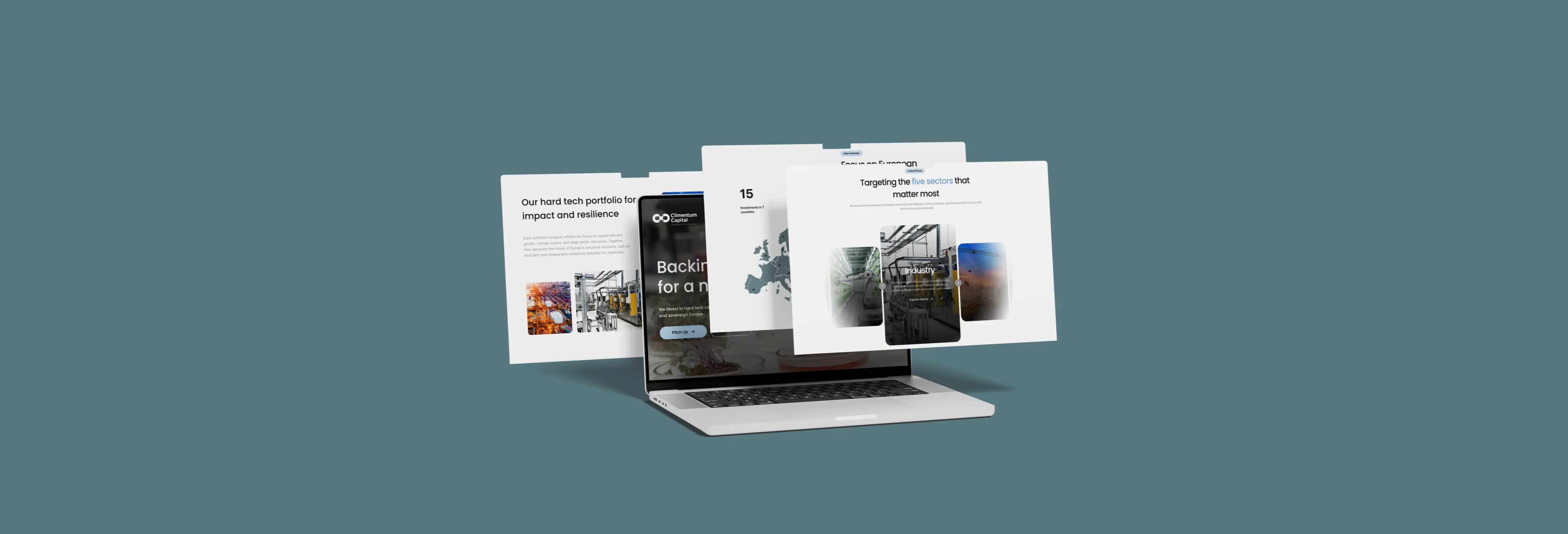
We transformed Climentum Capital's static website into a living experience. The goal was to mirror their impactful mission of fighting the climate crisis by creating a site that breathes Scandinavian calm, communicates conviction, and builds trust. The redesign focused on turning their powerful purpose into a palpable online presence, moving beyond logic to connect with visitors on an emotional level.
Service:
Website Design
Client:
Climentum Capital
Turning Purpose Into Presence
Climentum Capital invests in startups fighting the climate crisis. Their old website stated their mission, but it didn't convey the urgency and vision behind it. We set out to create a digital experience that would make visitors feel their impact, turning a static site into a powerful tool for connection and trust.
What was the main objective of the redesign?
To transform the website into an emotional, living experience that matches the fund's impactful mission and builds trust with visitors.
What was the inspiration for the new design?
The design was inspired by Scandinavian aesthetics: calm, open space, deliberate typography, and soft, purposeful motion to communicate trust.
What was the core design philosophy?
Every pixel must serve a purpose. The focus was on clarity, confidence, and momentum, removing all clutter and distractions.
What was the key challenge to overcome?
The challenge was to build credibility and convey the brand's vision emotionally, making visitors feel the mission, not just read about it.
The Mission: From Logic to Emotion
Climentum isn't a typical fund. They invest in startups that fight the climate crisis with real, science-based solutions. While their old website explained this logically, it lacked emotional resonance. It looked predictable and safe, whispering a message that needed to roar. Visitors couldn't feel the urgency or vision behind the brand. Our mission was to bridge that gap and build a presence that matched their impact.
The Challenge: Design That Thinks
Our goal wasn’t just to 'make it prettier.' It was to make it work harder—psychologically and strategically. We focused on building trust from the first millisecond and guiding users' decisions without them noticing. This led to a core rule: Every pixel must serve a purpose. We eliminated clutter and distractions to create a clear, confident, and momentum-driven experience.
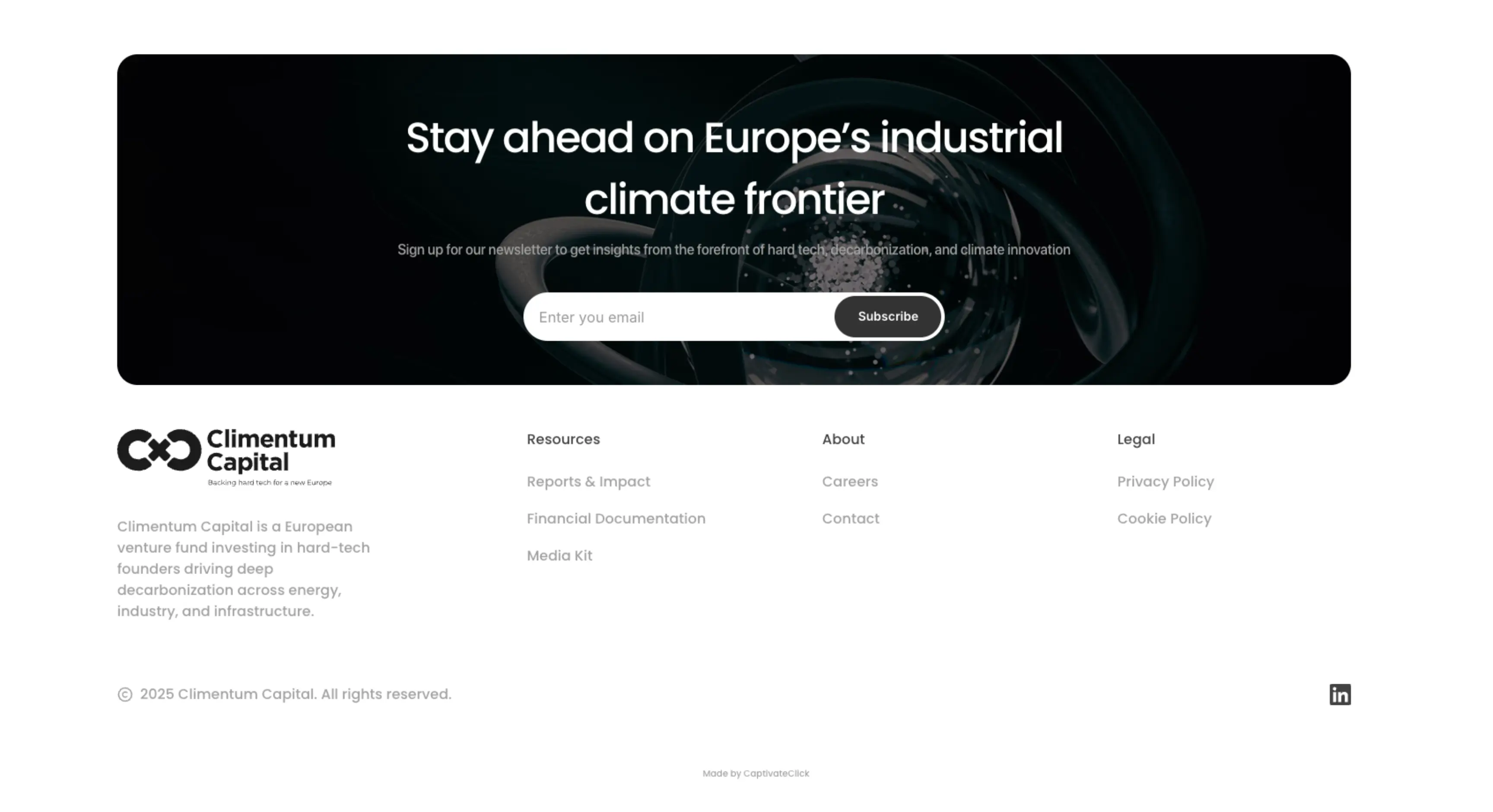
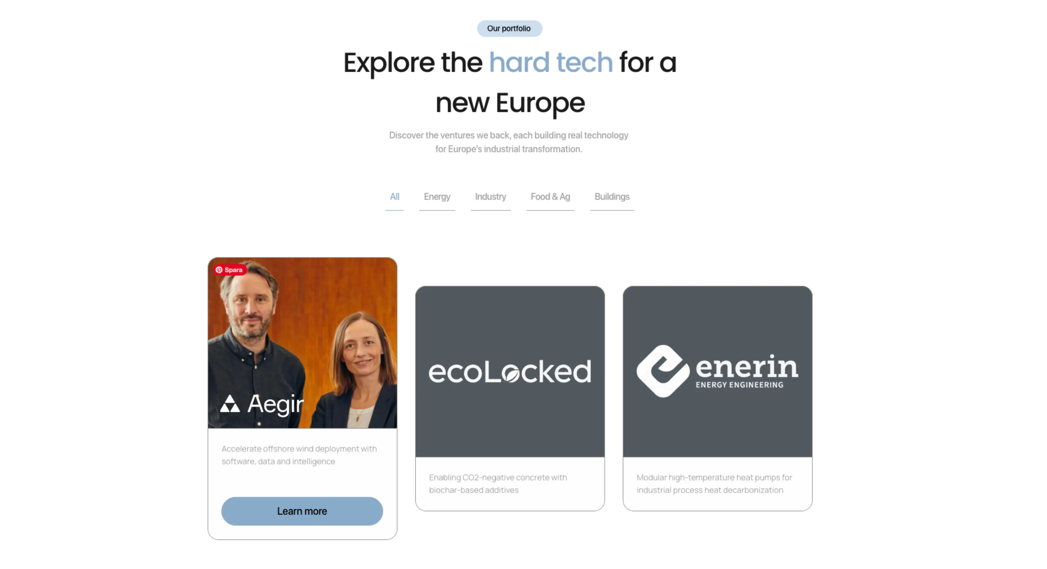
The Process: Scandinavian Calm, Purposeful Motion
Starting in Figma, we custom-built every section, inspired by Scandinavian design's ability to communicate trust through open space, deliberate typography, and restraint. We paired this aesthetic with modern web psychology, designing every interaction to feel effortless. Animations are soft, not flashy, guiding attention rather than demanding it. This deliberate rhythm keeps users engaged and moving forward.
The Transformation: A Brand That Feels Like Itself
The new site gave Climentum a new perception. Partners called it 'bigger' and 'alive.' Investors spent more time on key pages, and founders understood the story faster. The brand gained a digital gravity that made people stay, transforming the website from a brochure into a belief system. It was the difference between reading about a mission and feeling part of it.
Conclusion: Design Is Psychology
When you understand behaviour, design becomes persuasion. When you understand emotion, design becomes connection. The Climentum redesign achieved this by combining both. The result is more than a website; it's a digital experience that embodies who they are: visionary, credible, and unstoppable. It’s a site that whispers confidence and makes people believe.