Transforming Northfork from Generic SaaS to Enterprise-Grade Platform
Northfork needed a website that better reflected their role as a trusted tech partner for major retailers, publishers, and brands. Their previous site looked modern but didn’t fully communicate the depth of their product ecosystem or their position in the market. We restructured the platform to clarify their offering, define distinct audience pathways, and strengthen credibility. This was not just a cosmetic update, but a repositioning to reflect infrastructure-level capability, resulting in a more confident user experience and a stronger demo-driven conversion flow.
Website Design
Northfork
Building a Product-Led Enterprise Platform
We worked with Northfork to reshape a website that looked modern but didn’t fully communicate the depth of their product ecosystem or their position as a trusted tech partner. The result is a structured, product-led platform that builds trust instantly and turns attention into demo conversations.
What was the key challenge in this project?
Communicating the depth of Northfork’s product ecosystem without overwhelming visitors, while clearly separating multiple enterprise audiences.
How was the user experience improved?
We introduced clearer structure, defined audience pathways, and a stronger visual hierarchy, making the platform easier to navigate and understand.
How was audience segmentation handled?
We developed dedicated solution pages for retailers, publishers, brands, and agencies to provide clearer positioning and audience-specific value.
What was the core design philosophy?
A modern, clean, and innovative approach. Tech-forward but never sterile. Intentional motion, strong hierarchy, and visual contrast were used to reinforce clarity and trust.

The Challenge: When Modern Isn’t Enough
Northfork’s previous website looked modern at first glance, but it lacked structural clarity. Product depth was difficult to grasp, audiences were blended together, and key value propositions were buried. The site didn’t reflect the maturity of the platform or their role as an infrastructure-level partner. What appeared polished lacked strategic definition, failing to communicate the depth of their ecosystem to enterprise buyers.
The Strategy: Architecture as Clarity
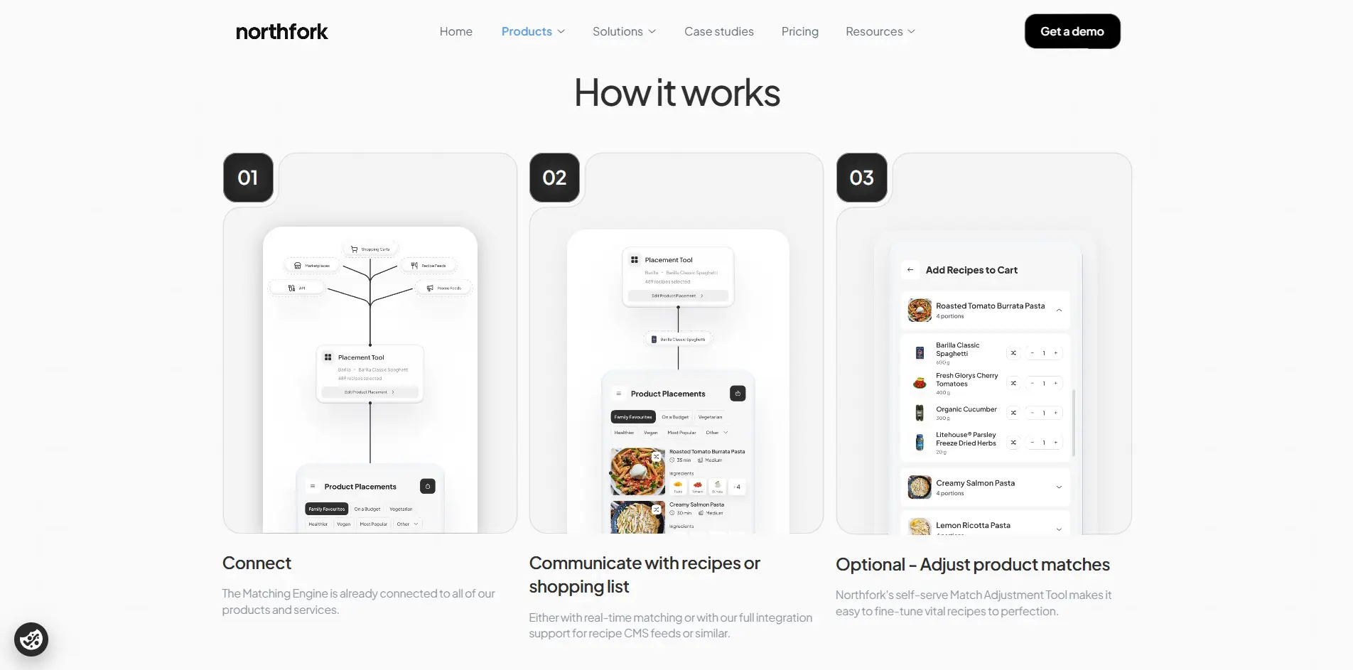
This was a repositioning from a marketing site to an infrastructure platform. We reorganized the information architecture into clear pillars—Products, Solutions, Case Studies, Pricing, and Resources—mirroring how enterprise buyers evaluate complex platforms. We elevated key products into a modular structure with clear hierarchy and created dedicated solution pathways for retailers, publishers, brands, and agencies, ensuring messaging feels specific rather than generalized.
The Design: Tech-Forward, Never Sterile
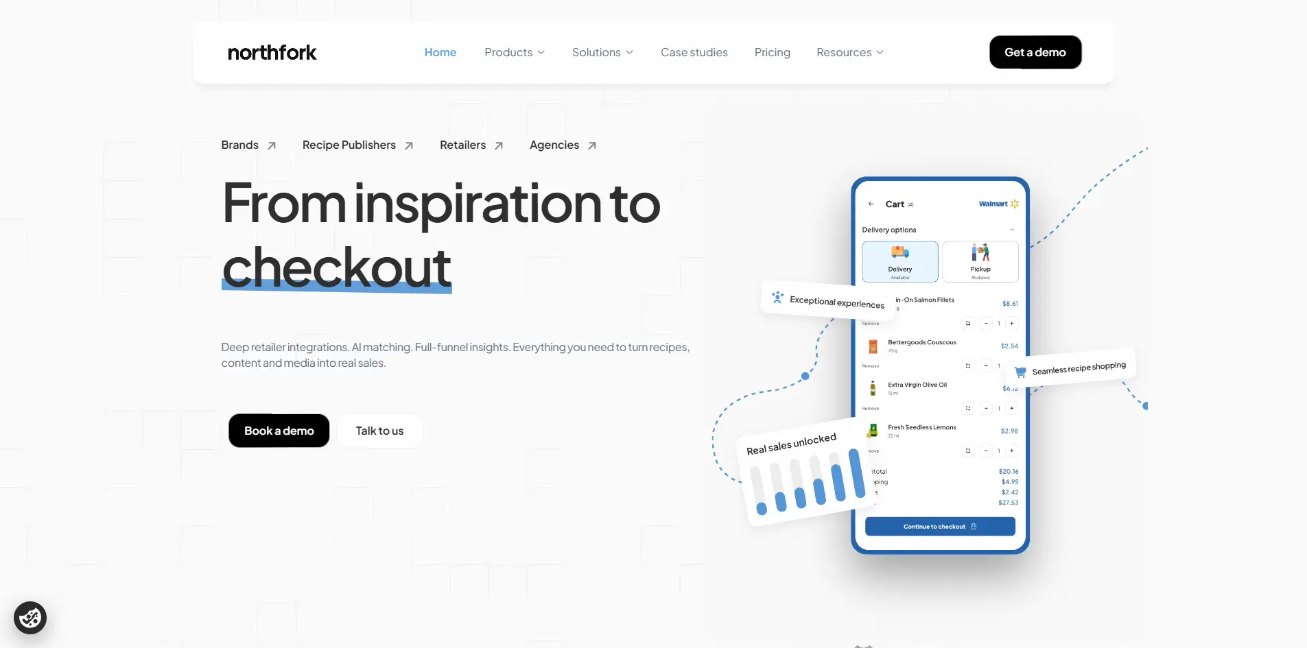
The visual direction followed a clear principle: modern and innovative, but never sterile. We used a clean black-and-white base punctuated by bold accent contrasts and strong structural hierarchy to create a confident, tech-forward presence. Intentional motion and subtle animations guide attention subtly, reinforcing clarity rather than distracting from it. The result is disciplined, technical, yet human.

The Outcome: Structure Creates Confidence
Northfork’s digital presence now accurately reflects its maturity as an enterprise platform. By structuring the homepage as a narrative journey—from attention to proof, product depth, and finally demo conversations—the site guides users rather than pushing them. The new platform communicates product depth instantly, separates audiences clearly, and builds trust early, resulting in a stronger, demo-driven conversion flow that scales effortlessly with growth.
