
Your homepage is not just a welcome mat. It’s your digital storefront, your master salesperson, and your brand’s first handshake, all rolled into one. You have less than three seconds before a visitor decides to stay or leave forever. Is your homepage working for you, or is it actively costing you money?
Too many e-commerce sites suffer from the same fatal flaws. They have high bounce rates, dismal engagement, and a user journey so confusing it leads to abandoned carts before a single item is even added. These are not just numbers on a spreadsheet; they are lost customers, missed opportunities, and wasted ad spend.
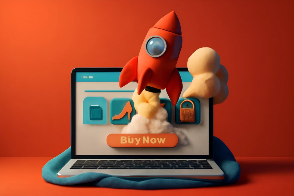
This guide is your blueprint for turning that around. We will break down the essential elements, from the psychology of design to the nuts and bolts of technical performance, to transform your homepage into a relentless conversion machine. At CaptivateClick, we’ve spent over 15 years engineering captivating digital storefronts that are strategically built to convert, and now we’re sharing that knowledge with you.
The First Impression: Mastering the Above-the-Fold Experience
Nail Your Value Proposition with a Killer Headline
Be clear, not clever. The moment someone lands on your page, they should instantly understand what you sell and who it’s for. Confusion is the ultimate conversion killer; clarity builds the immediate trust you need to make a sale.
Your headline must scream value. Don't just list a product; promise a solution to a painful problem. Instead of “We Sell Ergonomic Shoes,” try “The Most Comfortable Shoes for All-Day Wear.” This shift focuses on the core human desire for comfort and relief, making your product an essential solution, not just another option.
Use High-Impact Hero Visuals
Your hero section—the large visual at the top of your page—is your digital curb appeal. A professional, high-quality photograph showing your product in a lifestyle context connects with visitors on an emotional level. According to one study, using authentic, non-stock imagery is a key e-commerce design best practice because it builds immediate credibility.
Forget generic stock photos that scream "we're just like everyone else." Use authentic images or even a short, compelling video of real people enjoying your products. This strategy taps into the primal need for connection and shows visitors the better version of themselves they can become with your product in their life.
Craft a Compelling Primary Call-to-Action (CTA)
Your primary CTA button is the single most important link on your homepage. It must be impossible to ignore. Use strong, action-oriented verbs like Shop Now, Explore the Collection, or Discover Your Style to create a sense of momentum.
Make your button stand out with a color that contrasts sharply with its background. This isn't just about aesthetics; it's about guiding the user's eye directly to the action you want them to take. For a deeper look into this, explore these effective call-to-action placement techniques to turn a simple button into a powerful conversion driver.
Simplify the Journey: Intuitive Navigation and User Experience (UX)
Make Your Search Bar Unmissable
Do you know who your most valuable visitors are? They’re the ones who use your search bar. In fact, e-commerce visitors who use site search are known to convert at a higher rate because they have a clear purchase intent.
Don’t make them hunt for it. Place your search bar prominently at the top of the page where it’s expected to be. Supercharge it with smart features like auto-complete and visual product suggestions to reduce friction and get them to the right product faster than ever.
Organize with Logical Category Navigation
Your navigation menu is the map to your store. If it’s confusing, your customers will get lost and leave. Use simple, familiar terms that your customers would actually use—think “Men’s Shirts,” not “Gentlemen’s Haberdashery.”
For stores with a wide range of products, a well-designed mega menu can be a game-changer. It allows you to display categories and subcategories without overwhelming the user. The goal is to create a seamless path from homepage to product, a core principle we detail in our guide to crafting intuitive UI/UX for e-commerce.
Prioritize a Flawless Mobile Experience
Your website doesn't just live on a desktop anymore. With mobile commerce accounting for a massive share of online sales, a responsive design is absolutely non-negotiable. Your homepage must look and function perfectly on every screen, from a tiny smartphone to a large monitor.
Think about the physical experience of using a phone. Are your buttons and links large enough for easy tapping? As MoBiloud points out, thumb-friendly navigation is a critical mobile e-commerce best practice that directly impacts user satisfaction and sales. A clunky mobile site is a direct insult to more than half of your potential customers.
Build Instant Trust and Credibility
Leverage the Power of Social Proof
Humans are wired to follow the crowd. It’s a survival instinct. You can leverage this by showcasing social proof directly on your homepage to build instant trust with new visitors.
Feature short, powerful customer testimonials or display an average star rating near the top of the page. If you’ve been featured in the media, display those "As Seen In" logos proudly. An embedded feed of user-generated content, like Instagram photos of customers using your products, provides authentic, undeniable proof that people love what you sell. To learn more, see our guide on integrating social proof and reviews to enhance trust.
Display Trust Badges and Key Information
First-time visitors are subconsciously looking for reasons not to trust you. They are afraid of being scammed. You must proactively eliminate that fear.
Display universally recognized payment and security logos like Visa, Mastercard, and McAfee Secure to signal that their financial information is safe. Use clean, simple icons to highlight your key selling points and risk-reversals, such as Free Shipping, Easy Returns, or 24/7 Support. These small visual cues provide massive psychological reassurance.
Showcase Products and Drive Action
Feature Your Best-Sellers and New Arrivals
Don't force new visitors to figure out where to start. Guide them by featuring a curated collection of your best-selling products right on the homepage. This reduces choice paralysis and uses the power of social proof to show them what’s popular.
For your loyal returning customers, a "New Arrivals" section keeps the experience fresh and exciting. It gives them a reason to come back often, tapping into the human desire for novelty. This simple strategy serves both new and existing customers simultaneously.
Promote Special Offers and Sales Prominently
Is there a sale or a special offer running? Don't hide it. Use a prominent announcement bar or banner at the very top of your homepage to communicate site-wide promotions.
A simple message like
Free Shipping on All Orders Over $50can dramatically increase your average order value. VWO confirms that using announcement bars is an e-commerce homepage best practice for driving immediate action and boosting conversions. It creates a sense of urgency and rewards customers for shopping with you right now.
Personalize the Experience
Imagine walking into a store where the clerk remembers what you looked at last time. You can create this powerful, personalized experience online. Implement dynamic content that shows returning visitors their recently viewed items.
You can also use their browsing history to provide tailored product recommendations. This level of personalization makes your customers feel seen and understood. It transforms your homepage from a static catalog into a dynamic, personal shopping assistant.
Don't Neglect the Technicals: Speed and Performance
Page Load Speed is a Conversion Factor
In the world of e-commerce, speed equals money. According to Unbounce, if your homepage takes longer than 3 seconds to load, you could be losing nearly half of your potential visitors. Every millisecond counts.
A slow website doesn't just frustrate users; it actively destroys your conversion rate and damages your brand's reputation. You can dramatically improve your site speed by compressing images, leveraging browser caching, and investing in high-quality hosting. These are not just technical tweaks; they are fundamental business decisions that directly impact your bottom line. For more on this, explore our guide to technical optimization best practices for faster websites.
Ensure Your Homepage is SEO-Friendly
The most beautiful, high-converting homepage in the world is useless if no one can find it. Basic on-page search engine optimization is crucial. Ensure your primary keyword is included naturally in your main H1 headline, your page's title tag, and the meta description.
This simple act helps search engines understand what your page is about, making it more likely to appear in front of customers who are actively searching for what you sell. As detailed in this comprehensive e-commerce SEO guide, a well-structured page with clear headings is fundamental for both users and search engine crawlers.
Test, Measure, and Iterate
The Power of A/B Testing
Stop guessing what works. Start knowing. A/B testing is the process of showing two different versions of a page element to your visitors to see which one performs better.
Don't know if a red or a green CTA button converts more customers? Test it. Unsure which headline resonates most deeply with your audience? Test it. Small changes to headlines, hero images, and CTA text can lead to massive improvements in your conversion rate. For a deeper dive, check out these innovative A/B testing techniques for e-commerce.
Use Analytics to Understand User Behavior
Your website analytics are not just data; they are the voice of your customer. Pay close attention to key metrics like bounce rate, average time on page, and, of course, your overall conversion rate. These numbers tell you a story about what’s working and what’s broken.
Go a step further with tools that generate heatmaps. A heatmap visually shows you where users are clicking, tapping, and scrolling on your homepage. This insight is like being able to look over your customer's shoulder, revealing exactly where they get stuck or what grabs their attention, allowing you to make data-driven decisions instead of flying blind.
Your Homepage is a Living Asset
Optimizing your e-commerce homepage is not a one-and-done task. It is a continuous process of improvement fueled by data and a deep understanding of your customer. Remember the core pillars: make an unforgettable first impression, create a seamless user journey, build unshakable trust, showcase your products with purpose, and ensure flawless technical performance.
Your homepage is a living, breathing asset that should evolve with your business and your customers. Listen to the data, test your assumptions, and never stop iterating. The reward isn't just a better homepage; it's a stronger, more profitable business.
Ready to Turn Your Homepage into a High-Converting Powerhouse?
Optimizing your e-commerce homepage is one of the highest-impact investments you can make in your business. At CaptivateClick, we specialize in creating captivating, user-centric web designs that are built to convert.


