Best website designs: 8 examples and what you can learn from them
Short answer: the best website designs are not the ones with the most effects, but the ones where every design choice helps visitors understand, trust and choose the business. The strongest sites usually have plenty of space, few colours, clear typography, real images and a message that shows immediately. Below are eight examples from British brands and our own projects, and what you can borrow from each.
Why design matters
In a study from Carleton University, participants formed a view of a web page's look in 50 milliseconds, and that view held when they looked for longer (Lindgaard et al., 2006). In Stanford's large study of web credibility, 46 percent of comments were about the site's design, more than anything else (Stanford and Consumer WebWatch). And visitors often leave a page within 10 to 20 seconds if they do not understand what it offers (Nielsen Norman Group).
A good-looking website buys you time. What it does with that time decides whether the visitor stays.
Three British brands
1. Monzo: one promise, then proof
Monzo's homepage opens with a single line, "Spend your money on life, not your life on money", and then backs it up section by section with features and trust signals such as "A regulated bank with 24/7 support" and Which? recommendations (Monzo). Its bright card colour runs through the design as a recognisable accent.
What you can borrow: lead with one clear promise, then let each section prove it. Put trust signals where doubts arise, not hidden in the footer.
2. Octopus Energy: one action everywhere
Octopus Energy's homepage leads with social proof, "Join the UK's most popular energy supplier", and repeats one action, "Get a quote", throughout the page (Octopus Energy). Its octopus mascot gives a technical product a friendly face.
What you can borrow: decide the one thing you want visitors to do and make it visible in every section. A character or illustration style can make a dry service memorable.
3. innocent: a voice of its own
innocent's site does not sound like anyone else's. It introduces itself in lower case with "we're innocent", and the navigation mixes products with things like its Big Knit campaign and B Corp story (innocent drinks).
What you can borrow: a clear personality. You do not need to go as far, but words and visuals that are your own make you easier to remember.
Five examples from our own projects
4. Climentum Capital: Scandinavian calm
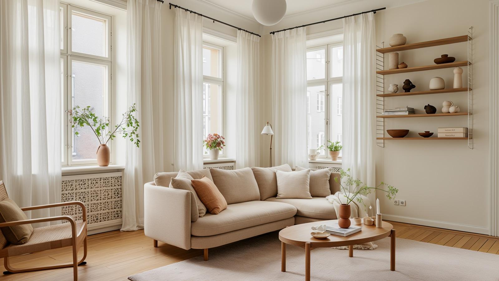
For venture fund Climentum, which invests in climate tech, the design started from Scandinavian restraint: open space, deliberate typography and calm motion. Partners described the new site as "bigger" and "alive". Read the case study.
5. Nordic Acceleration Group: structure as authority
When Nordic Acceleration Group was named one of Sweden's fastest-growing companies in 2025, its site had to match the company's growth, in two weeks. The answer was clear structure: simpler navigation, clear service blocks and a logical story from top to bottom. Read the case study.
6. Northfork: modern, never sterile
Northfork's previous site looked modern but was hard to understand. The new one is built on a black-and-white base with strong accent colours and a homepage that tells the story in order: attention, proof, product depth and finally a demo call. Read the case study.
7. LexEnergy: colour that leads
For energy company LexEnergy, neon-yellow accents were given one job: showing visitors where to click. Buttons in the contrast colour recur on every page, and the forms have few fields. Read the case study.
8. RTL Consulting: readability first
For consultancy RTL Consulting, the focus was a consistent colour palette, clear icons and a hierarchy that guides visitors through the services. Contact enquiries rose by 30 percent after launch. Read the case study.
Seven principles behind great website design
- Space. Room around text and images makes a page calmer and easier to read. It is the first thing that separates a considered site from a template.
- Few colours, each with a job. A base, an accent and a button colour are enough. The accent should show what matters.
- Two typefaces at most. One for headings and one for body text, in clear sizes.
- Real images. Your premises, your people and your customers beat stock photos of smiling office workers.
- One message per section. A heading, one sentence and a next step.
- Motion with meaning. Animations should explain or guide, not just be seen.
- Great on mobile. Most visits come from phones. Design for that screen first.
To take your identity further than the website, see our page on branding.
What makes a website look cheap
- Low contrast. Light grey text on white is the most common accessibility error of all, found on 84 percent of the homepages WebAIM checked in 2026 (WebAIM). In the UK, the Equality Act also means your site should work for disabled visitors (legislation.gov.uk).
- A carousel at the top. Rotating images shift focus and hide the message.
- Too much at once. Ten buttons, five colours and three typefaces.
- Slow loading. The best design does not help if the page takes five seconds to appear. Google's threshold for a good load time is 2.5 seconds for the largest content (web.dev). Read Core Web Vitals explained.
- An obvious template. The same theme as your competitor, with the same images.
Want to take the first step yourself? Read Website templates or build from scratch? and What makes a good website?
Frequently asked questions
What makes a good website design?
Plenty of space, few colours with clear jobs, two typefaces at most, real images and one message per section. The design should help visitors understand, trust and choose the business, not just look trendy.
Does it matter if a website looks good?
Yes. Research shows visitors judge how a site looks in 50 milliseconds, and that design is what people mention most when judging whether a site is credible.
Which UK brands have great websites?
Monzo, Octopus Energy and innocent are examples of British brands with well-made sites, in different ways: Monzo with one clear promise and proof, Octopus Energy with one action everywhere, and innocent with a voice of its own.
How do you make a website look modern?
Start with structure and message, choose a simple colour palette and clear typography, use real images and design for mobile first. Make sure the page loads fast and has good contrast.
Can a website built from a template look good?
Yes, if it is adapted with your own images, your own copy and a considered colour palette. The problem comes when the template is obvious, with the same theme and images as many others.
Sources
- Attention web designers: You have 50 milliseconds to make a good first impression!, Lindgaard et al., Behaviour & Information Technology
- How Do People Evaluate a Web Site's Credibility?, Stanford Web Credibility Project and Consumer WebWatch
- How Long Do Users Stay on Web Pages?, Nielsen Norman Group
- Monzo, Monzo
- Octopus Energy, Octopus Energy
- innocent drinks, innocent drinks
- The WebAIM Million, WebAIM
- Web Vitals, web.dev (Google)
- Equality Act 2010, section 29, legislation.gov.uk