
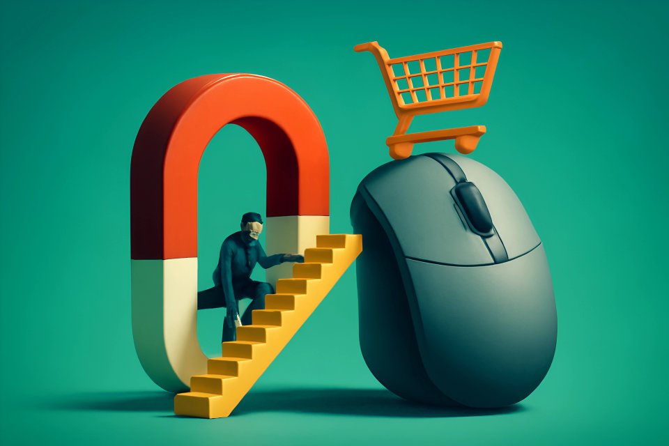
Is your website bleeding potential sales? You’ve poured heart, soul, and hard-earned cash into driving traffic, only to see visitors vanish without a trace. Here’s a gut punch: a tiny 1% improvement in your website's conversion rate can explode your revenue by an incredible 3.3%, often without needing a single extra visitor, as highlighted by research from RetailSensing. That’s the raw power of Conversion Optimization, or CRO. Simply put, CRO is the science and art of systematically turning more of your website visitors into paying customers, eager leads, or loyal subscribers.
Why should this be your obsession? Because in today's digital battlefield, traffic alone doesn't pay the bills. Results do. CRO is the engine that transforms clicks into cash, ensuring your online presence isn't just a pretty face but a relentless profit-generating machine. It’s about maximizing every opportunity, squeezing every last drop of value from the audience you already have. This article will arm you with the conversion optimization techniques to increase website sales by diving deep into understanding your users, implementing critical UX enhancements, crafting persuasive design and copy, and mastering the game-changing power of A/B testing.
At CaptivateClick, we've witnessed firsthand, over and over, how strategic conversion optimization techniques to increase website sales can fundamentally reshape a business's trajectory. We've seen companies go from struggling to thriving, all by focusing on making their websites work smarter, not just harder. Get ready to unlock the secrets that turn casual browsers into committed buyers.
Why User Understanding is Non-Negotiable for Higher Conversions
You can't sell effectively if you don't know who you're selling to. It's like shouting into the wind and hoping someone hears your message. To truly connect and convert, you must first walk a mile in your customer's shoes, understanding their deepest desires, fears, and motivations. This isn't fluff; it's the bedrock of every successful conversion strategy.
Know Your Audience
Want to hit the bullseye every time? Start by crafting detailed buyer personas. These aren't just vague descriptions; they are semi-fictional representations of your ideal customers, built on real data and insights. HubSpot emphasizes that buyer personas are critical for aligning your marketing strategies directly with what your audience truly needs and wants, allowing for campaigns that resonate deeply.
To build these powerful personas, dive into your analytics. Tools like Google Analytics offer a goldmine, revealing demographics and how users navigate your site through its Behavior Flow, as Whatagraph's insights on Google Analytics show. But don't stop there. Employ heatmaps from tools like Hotjar or Crazy Egg to see where users click and scroll, and watch session recordings to witness their actual journey, frustrations and all – UXCam highlights how session recordings expose usability issues. Combine this with direct feedback from user surveys and customer support call analysis, which, according to Insight7's findings, can uncover recurring pain points like pricing concerns or feature misunderstandings that kill conversions. At CaptivateClick, our approach to effective UI/UX design always begins with this deep, empathetic user research.
Mapping the Customer Journey
Once you know who your audience is, you need to understand how they interact with you. Mapping the customer journey means identifying every critical touchpoint, from their first awareness of your brand to the final decision to buy. Think of it as creating a roadmap of their experience, noting every twist, turn, and potential roadblock.
At each stage – awareness, interest, consideration, decision – your user has different questions and different intent. Are they just learning about solutions like yours, or are they comparing specific features and pricing? Understanding this intent allows you to deliver the right message at the right time, guiding them smoothly towards conversion. Whatagraph points out that entry pages, like landing pages, significantly influence subsequent user actions, making their optimization vital for funnel efficiency.
Identifying Conversion Blockers
Your website might be unintentionally sabotaging your sales. Common conversion blockers lurk everywhere: confusing navigation that makes users feel lost, painfully slow load times that test their patience, a value proposition so murky they don't understand what you offer, or a checkout process so complicated they simply give up. These friction points are silent killers of your conversion rates.
The good news? Data can illuminate these dark corners. Use your analytics to pinpoint pages with high drop-off rates. As Whatagraph notes, high exit rates on specific pages are clear signals of underlying design or content issues that scream for A/B testing or usability improvements. Are users abandoning their carts at a specific step? Are they bouncing from a key landing page? These are your red flags, your starting points for optimization.
Boosting Sales with User-Centric Design: Key UX Conversion Tips
Imagine walking into a store that's cluttered, poorly lit, and impossible to navigate. You'd walk right out, wouldn't you? Your website is no different. A clunky, confusing user experience (UX) is a guaranteed way to send potential customers running to your competitors. To truly boost sales, your website must be a welcoming, intuitive, and efficient environment designed entirely around the user's needs.
Crystal-Clear Navigation & Site Structure
Can visitors find what they need on your site in seconds? If not, you're losing them. Intuitive menus and a logical information architecture are paramount. Users shouldn't have to think; they should just know where to go. Maze highlights that consistent design systems, including colors and fonts, reduce cognitive load, making navigation feel effortless.
A well-thought-out internal linking strategy also plays a crucial role. It not only helps search engines understand your site but also guides users to relevant content and conversion points. Think of it as creating clear pathways that lead visitors exactly where you want them to go. For businesses looking to overhaul their online presence, exploring professional Web Design services that prioritize user experience can be a game-changer.
Mobile-First Optimization
Your customers are on the move, and your website needs to keep up. With a significant chunk of web traffic coming from mobile devices, a flawless experience on smartphones and tablets isn't a luxury—it's a necessity. Shockingly, CleverTap data reveals that mobile conversion rates often lag behind desktop by as much as 2.1%, frequently due to navigation challenges and a poorer user experience on smaller screens.
This means embracing mobile-first design. Don't just shrink your desktop site; rethink the experience for the mobile user. Whether you opt for responsive design (fluidly adapting to screen size) or adaptive design (serving different versions for different devices), the goal is the same: ensure every button is tappable, every text is readable, and every interaction is smooth.
Blazing-Fast Page Load Speed
In the digital age, patience is a scarce commodity. If your pages take an eternity to load, visitors will hit the back button faster than you can say "conversion." Page speed doesn't just impact conversions; it's a critical factor for SEO too. According to Bluehost, Accelerated Mobile Pages (AMP) can improve mobile load times by a staggering 50%, significantly reducing bounce rates.
How do you achieve lightning speed? Optimize your images, leverage browser caching, and minify your code (HTML, CSS, JavaScript). These technical tweaks can make a world of difference. For those serious about peak performance, diving into technical optimization best practices for faster websites or understanding effective hosting and maintenance strategies is essential.
Simplified Forms & Checkout Processes
Is your contact form asking for their grandmother's maiden name? Is your checkout process a ten-step odyssey? Complicated forms and convoluted checkouts are conversion killers. Every unnecessary field you ask a user to fill out increases friction and the likelihood they'll abandon the process.
Minimize form fields to only what's absolutely essential. For e-commerce, offer guest checkout options; not everyone wants to create an account just to make a purchase. Bluehost notes that simplified checkout flows incorporating digital wallets like Apple Pay can slash cart abandonment by 18%. Progress indicators can also help by showing users how close they are to completion, making the process feel less daunting. If you're in e-commerce, refining this part of your site with expert e-commerce web design insights is non-negotiable.
High-Quality Visuals & Product Presentation
People are visual creatures. Especially in e-commerce, your product images and videos are your virtual salespeople. Grainy, unprofessional visuals scream "amateur" and erode trust. Invest in high-quality, professional photography and videography that showcases your products in their best light.
Provide multiple angles, zoom functionality, and videos demonstrating your product in use. Omnisend reports that high-resolution images with zoom functionality can increase add-to-cart rates by a significant 27%. Let your visuals tell a story and help customers imagine themselves owning and benefiting from your product.
Building Trust & Credibility
Why should a visitor trust you with their money or information? You need to earn that trust, visibly and consistently. Testimonials, reviews, and case studies are powerful trust signals. Seeing that others have had positive experiences with your brand can dramatically lower a new visitor's skepticism.
Display security badges prominently, especially SSL certificates and payment gateway logos, to reassure users their data is safe. Make your contact information easy to find and offer clear support channels. According to Omnisend, user-generated content (UGC) like customer reviews in galleries can build trust and lift conversions by 19%. Transparency and accessibility are key to making visitors feel secure and confident in doing business with you.
The Art of Persuasion: Design and Copy That Drive Action
Your website can be beautiful, fast, and easy to navigate, but if it doesn't persuade visitors to take action, it's failing. Persuasive design and compelling copywriting work hand-in-hand to tap into human psychology, motivating users to click that button, fill out that form, or make that purchase. It's about making them want what you offer, desperately.
Compelling Value Propositions
What's in it for them? Your value proposition must answer this question instantly and unequivocally. It's the core promise you make to your customers – the unique benefit they get from choosing you over anyone else. This needs to be front and center, especially in your headline, sub-headline, and hero section.
Jeffries Digital suggests a powerful formula for value clarity headlines: [Product/Service] helps [target audience] achieve [desired outcome] without [common pain point]. This kind of direct, benefit-driven statement cuts through the noise and grabs attention immediately. If your visitor doesn't understand your value in seconds, they're gone.
Irresistible Calls-to-Action (CTAs)
Your Call-to-Action is the gatekeeper to your conversions. It needs to be impossible to miss and utterly compelling. Design plays a huge role: think contrast, size, and strategic placement. DashClicks found that contrasting CTA colors (like orange on a blue background) can improve visibility and clicks by an impressive 38%.
But design is only half the battle; the copy is crucial. Ditch generic phrases like "Submit" or "Learn More." Instead, use action-oriented, benefit-driven language. For example, Get Your Free Quote Now! or Unlock Exclusive Access Today! are far more enticing. Landingi reports that action-oriented CTAs like “Start My Free Trial” outperform generic “Submit” buttons by a whopping 32%.
Leveraging Social Proof
Humans are social creatures; we look to others to guide our decisions. Social proof, in its many forms, is one of the most powerful persuasive tools at your disposal. It’s not just about testimonials anymore. Think bigger: user-generated content, glowing media mentions, logos of well-known partners or clients.
Landingi highlights that social proof widgets displaying recent purchases can build urgency and trust simultaneously, tapping into the fear of missing out (FOMO). When visitors see that others are buying from you, trusting you, and succeeding with you, their own perceived risk plummets.
Scarcity & Urgency (Used Ethically)
Fear of missing out is a potent motivator. When used ethically, scarcity and urgency can significantly nudge visitors towards making a decision. Limited-time offers, low stock indicators (Only 3 left!), or countdown timers for special deals create a sense of immediacy.
InventorySource reveals that time-limited offers featuring countdown timers can increase conversion rates by as much as 50% by compelling users to act now rather than later. The key is authenticity; don't fabricate scarcity, as this can damage trust in the long run.
Benefit-Oriented Language
Stop talking about features; start shouting about benefits! Your customers don't care about the technical specifications of your product nearly as much as they care about how it will solve their problems or improve their lives. Translate every feature into a tangible benefit.
Instead of saying "Our software has a 128-bit encryption," say "Keep your sensitive data completely secure and sleep soundly at night." Jeffries Digital emphasizes that benefit-driven bullet points focusing on outcomes (e.g., “Save 5 hours of tedious work each week”) are far more persuasive. This is where powerful Branding and Ad Copy & Creative services can truly shine, crafting messages that resonate with core human desires.
Data-Driven Decisions: Implementing Effective A/B Testing Strategies
Guesswork is the enemy of growth. If you're not testing, you're leaving money on the table, plain and simple. A/B testing, also known as split testing, is the engine of continuous improvement, allowing you to make data-backed decisions that systematically enhance your website's performance. It’s how you turn good into great, and great into unstoppable for website sales optimization.
What is A/B Testing (and a nod to Multivariate Testing)?
At its core, A/B testing is a beautifully simple concept. You create two versions of a webpage element – say, headline A and headline B – and show them to different segments of your audience simultaneously. The version that performs better (e.g., gets more clicks or conversions) is your winner. This methodical approach allows you to isolate what works and what doesn't.
Multivariate testing (MVT) takes this a step further, allowing you to test multiple variations of multiple elements on a page at the same time. For instance, you could test two headlines, two images, and two CTA buttons all at once. HubSpot explains that multivariate testing helps isolate the impact of individual changes within more complex layouts, identifying the most effective combination. Both A/B and multivariate testing are crucial for making informed website sales optimization choices.
What to Test
The possibilities for testing are virtually endless, but you need to be strategic. Don't just test random elements; focus on those with the highest potential impact on your conversion goals. Common candidates for A/B testing include:
- Headlines and sub-headlines
- Call-to-Action button text, color, size, and placement
- Images and videos
- Page layouts and navigation structure
- Form lengths and field types
- Pricing structures and discount offers
- Value propositions
Hotjar's tools, like continuous heatmap capture, are invaluable for identifying underperforming page elements that are prime candidates for your next A/B test. These insights help you form strong hypotheses about what changes might yield better results.
The A/B Testing Process
A successful A/B testing program follows a clear, repeatable process. First, you must formulate a hypothesis based on data and user insights (perhaps from those heatmaps or session recordings mentioned earlier). For example: "Changing the CTA button color from blue to orange will increase clicks because orange has higher contrast against our background."
Next, create your variations (Version A, your control, and Version B, your challenger). Determine your sample size and how long the test needs to run to achieve statistically significant results. Then, use A/B testing tools like Google Optimize, Optimizely, or VWO to run the test. WP Engine highlights that Google Optimize’s audience targeting can align tests with high-value user segments for more relevant data. Finally, analyze the results. Did your variation win? If so, implement it and start thinking about your next test. Iteration is key.
Common A/B Testing Pitfalls to Avoid
While A/B testing is powerful, it's easy to make mistakes that invalidate your results. One common pitfall is testing too many things at once in a simple A/B test (this is where MVT is more appropriate). Another is not running tests long enough to collect sufficient data, or conversely, calling a test too early before it reaches statistical significance – HubSpot warns that statistical significance calculators are vital to prevent premature conclusions from small sample sizes.
Don't get discouraged if a test "fails" or doesn't produce a clear winner. Every test, regardless of outcome, provides valuable learning. The biggest mistake is giving up on testing altogether. Continuous optimization is a marathon, not a sprint. At CaptivateClick, our A/B Testing & Performance Tracking services are designed to navigate these complexities and drive consistent improvements.
Fine-Tuning Your Funnel for Maximum Conversions
Your website isn't just a collection of pages; it's a sales funnel, designed to guide visitors from initial awareness to final conversion. Each stage of this funnel presents unique opportunities for optimization. By fine-tuning these key stages, you can plug leaks, reduce friction, and dramatically increase the number of visitors who complete their journey to becoming customers. This is where effective conversion funnel optimization for high-ROI campaigns truly makes a difference.
Landing Page Optimization
Your landing pages are often a visitor's first direct interaction with a specific offer. They need to be laser-focused, with absolute clarity on the value proposition and a single, compelling call-to-action. Remove all distractions – no unnecessary navigation links, no competing offers. The goal is to keep the visitor on task and moving towards that one desired action, whether it's signing up for a webinar, downloading an ebook, or requesting a quote.
Ensure your landing page headline powerfully echoes the ad or link that brought the visitor there, creating a seamless experience. Use persuasive copy and strong visuals that reinforce the benefits of your offer. Every element should work in concert to convince the visitor that taking the next step is in their best interest.
Product/Service Page Optimization
For e-commerce sites and service-based businesses, your product or service pages are where the critical decision-making happens. These pages must be rich with information, yet easy to digest. Provide detailed descriptions that go beyond mere features, focusing on the benefits and solutions your offerings provide. Use high-quality images and videos to showcase your products from every angle or to demonstrate your service's value.
Clear pricing is essential; hidden fees or confusing pricing structures are major conversion killers. Reinforce trust with customer reviews, testimonials, and security badges. Make it incredibly easy for visitors to understand what they're getting and why it's worth the investment.
Cart & Checkout Optimization (E-commerce focus)
Cart abandonment is the bane of e-commerce. You've done all the hard work to get a customer to add items to their cart, only to lose them at the final hurdle. Optimize this critical stage by making the checkout process as simple, transparent, and reassuring as possible. Minimize the number of steps and form fields. Be upfront about all costs, including shipping and taxes – no nasty surprises!
Offer multiple payment options to cater to different preferences. Display security reassurances prominently throughout the checkout. Omnisend data shows that abandoned cart SMS reminders can achieve 35% open rates, recovering an impressive 15% of sales, while SingleGrain notes that chatbot nurturing sequences can recover 12% of abandoned carts with personalized offers. These are powerful tactics to reclaim lost revenue.
Post-Conversion Optimization
The journey doesn't end when a visitor converts. What happens after they click "buy" or "submit" is crucial for building long-term relationships and maximizing customer lifetime value. Your thank-you page is prime real estate. Don't just say "thanks"; use this opportunity to suggest related products (upselling/cross-selling), encourage social shares, or ask for a review.
RetailSensing emphasizes that post-purchase follow-ups, like thank-you emails, significantly enhance lifetime value. Furthermore, SingleGrain reports that post-conversion upsell pages can increase average revenue per user (ARPU) by 19%. Consider how you can continue to engage new customers and turn them into loyal advocates for your brand, perhaps through effective email marketing campaigns.
Conclusion: Your Journey to Higher Sales Starts Now
You've just armed yourself with a powerful arsenal of conversion optimization techniques to increase website sales. We've journeyed through the absolute necessity of deeply understanding your users, the game-changing impact of stellar UX design, the magnetic pull of persuasive copy and design elements, and the undeniable power of data-driven A/B testing. These aren't just theories; they are proven, actionable strategies that can transform your website from a passive brochure into an active, relentless sales engine.
Remember, mastering conversion optimization is not a one-time fix; it's an ongoing, iterative process of learning, testing, and refining. The digital landscape is always evolving, and so are your customers' expectations. But the rewards – more leads, higher sales, and a thriving business – are well worth the consistent effort. Don't let another day pass by watching potential customers slip away. Start implementing these strategies today, one step at a time, and watch your website's performance soar.
Ready to turn more visitors into loyal customers and significantly boost your website sales? The experts at CaptivateClick are here to help. With over 15 years of experience in crafting captivating designs and strategic marketing, we can develop a tailored conversion optimization strategy specifically for your business. Contact CaptivateClick today for a consultation and let's elevate your brand's digital performance to heights you never thought possible!


